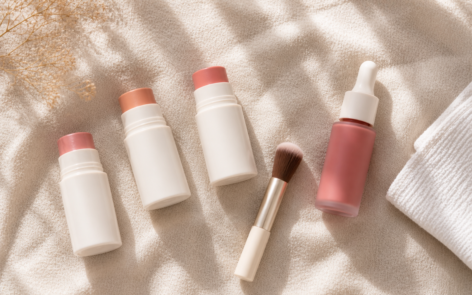
Why blush placement matters more than the product
Most makeup advice obsesses over which blush to buy. The honest reality: a $7 blush in the right placement consistently outperforms a $50 blush in the wrong one. Placement does the actual visual work — it shapes how light falls on your face, where the eye travels, and how features balance against each other.
The principles are simple. Blush placed higher lifts the face. Blush placed lower drags it down. Blush placed inward (toward the nose) makes a face read narrower. Blush placed outward (toward the temples) widens it. Different face shapes benefit from different combinations of these effects.
This isn't about hiding or correcting your face. It's about understanding which natural features you might want to emphasize, soften, or balance — and using blush placement to do it intentionally rather than by accident.
How to identify your face shape
Pull your hair back from your face. Look in a mirror with even lighting. Use your finger or a dry-erase marker on the mirror to trace your jawline, then notice three things:
- Where is your face widest? At the forehead, cheekbones, or jaw?
- How long is your face compared to its width? Roughly equal, or noticeably longer?
- Is your jawline angular or rounded? Soft curves or defined corners?
Match those three answers to the shapes below:
| Face shape | Widest point | Length vs. width | Jawline |
|---|---|---|---|
| Round | Cheekbones | Equal | Rounded |
| Oval | Cheekbones | Slightly longer | Soft, rounded |
| Square | Forehead, cheekbones, and jaw all similar | Equal | Angular |
| Heart | Forehead | Slightly longer | Tapered, narrow chin |
| Long (oblong) | Cheekbones | Noticeably longer | Variable |
If you're between two shapes, work with the dominant feature. Someone whose face is between round and oval should follow the round placement if their face length matches their width, or oval if it's noticeably longer.
Round face placement
Where to apply: Slightly above the apples of your cheeks, blending diagonally upward and outward toward your temples. Avoid the rounded center of the apple — that's where the natural roundness is most visible.
What it does: Creates the visual illusion of higher cheekbones and elongates the face. The diagonal sweep adds angular structure where the face naturally lacks it.
How to find the spot: Place two fingers on the apple of your cheek, then move up and slightly outward by about half an inch. That's your starting point. The blush extends from there toward your temple in a soft, diagonal direction.
What to avoid: Putting blush directly on the apples in a round dot. This emphasizes the natural roundness of your cheeks instead of balancing it.
Oval face placement
Where to apply: Directly on the apples of your cheeks, blending slightly upward and outward in a soft, diffused direction.
What it does: Maintains the natural balance of an oval face — which is already considered the most "balanced" shape — while adding a youthful flush.
How to find the spot: Smile at yourself in the mirror. The most prominent rounded part of your cheek that appears is the apple. That's where blush goes.
What to avoid: Sweeping blush dramatically upward toward the temples. Oval faces don't need lifting — they need the simple, classic placement to look polished.
Oval is the easiest face shape for blush placement. Almost any technique works on an oval face. If you're new to makeup and have an oval shape, the standard "apples of the cheeks" advice you've seen everywhere applies directly to you.
Square face placement
Where to apply: Diagonally across the cheekbones, sweeping from below the apple toward your temples. The placement is more elongated and angled than other shapes.
What it does: Softens the strong angles of a square face. The diagonal sweep draws the eye away from the corners of the jaw and toward the upper face, creating visual softness.
How to find the spot: Place your finger about an inch below your eye, just outside the apple of your cheek. Sweep upward toward the temple in a soft diagonal motion. The blush should fade out before reaching the hairline.
What to avoid: Round, dotted placement on the apples. Round shapes on a square face create visual conflict and emphasize the angularity of the jaw.
Heart-shaped face placement
Where to apply: Directly on the apples of your cheeks in a soft, rounded shape — but slightly more saturated than for other face shapes. Don't extend toward the temples.
What it does: Heart-shaped faces have a wider forehead and narrower chin. Centered blush on the apples adds visual weight to the middle of the face, balancing the proportions and drawing attention away from a wide forehead.
How to find the spot: Smile, find the apple, and apply blush in a slightly more concentrated round shape than oval placement. Keep the focus toward the center of the face rather than letting it drift outward.
What to avoid: Sweeping blush diagonally toward the temples. This widens the upper face — exactly what heart-shaped faces don't need.
Long (oblong) face placement
Where to apply: Horizontally across the cheekbones in a soft, sweeping motion. The blush extends slightly outward toward the ears, but stays low — never lifted upward.
What it does: Long faces benefit from any technique that adds horizontal width. The horizontal blush sweep visually breaks up the length of the face and creates a sense of balance.
How to find the spot: Place your finger directly on your cheekbone, about an inch below your eye. Sweep horizontally outward toward your ear, keeping the line level rather than curving up.
What to avoid: Vertical or diagonal-upward placement. Anything that lifts the face elongates it further, which is the opposite of what works on a long face shape.
Don't combine "sun-kissed" bronzer placement with horizontal blush on a long face. Bronzer placed under the cheekbones tends to elongate; horizontal blush is meant to widen. The two compete and create an unbalanced look.
Application technique by formula
The placement is the same regardless of formula, but the technique changes:
Cream blush
Apply with damp fingertips in tapping motions — never rubbing. The dampness helps it blend into the skin instead of sitting on top. For more saturated finish, use a clean fingertip; for a wash, use a damp beauty sponge.
Liquid blush
One drop is usually enough for both cheeks. Place a tiny dot at your starting position, then blend immediately with damp fingertips before it sets. Liquid blush dries fast — work quickly and don't apply too much at once.
Powder blush
Use a fluffy, slightly tapered brush. Tap excess product off the brush before applying. Use light circular motions in the placement zone. Build gradually rather than depositing pigment heavily in one motion.
Stick blush
Apply directly from the stick to the placement zone with light strokes, then blend immediately with damp fingertips. Stick formulas can look streaky if you don't blend fast.
Common placement mistakes
Even with the right shape-specific placement, certain habits ruin the result. Watch for these:
- Applying blush too low. Anything below the cheekbone line creates a downward visual pull and ages the face.
- Concentrating blush in a single dot. Real flush is diffused, not centered. Always blend outward in soft, gradient strokes.
- Skipping the blend toward temples. A hard edge of blush looks deliberate in the wrong way. Even centered placements should fade out softly.
- Wearing too-warm blush on cool undertones (or vice versa). Even perfect placement looks off if the undertone clashes with your skin. Cool undertones suit pinks and berries; warm undertones suit peaches and corals.
- Using powder blush on dry or mature skin. Powder settles into fine lines and emphasizes texture. Cream or liquid is gentler on aging skin.
- Ignoring how blush interacts with bronzer. If you use both, place blush above the bronzer line — never overlapping. The two should stay in separate zones.
The bottom line: Blush placement is geometry, not magic. Identify your face shape, follow the placement that balances your natural features, blend properly, and the same blush will transform how your face reads. The product matters far less than where it lands.